Looker Studio Alternatives: 10 Better Options for Dashboards and Reporting
Looker Studio is free, simple, and deeply connected to Google's ecosystem. For basic marketing dashboards, it works. But once you need more than five blended data sources, real data transformation, or governance beyond Owner/Editor/Viewer permissions, you hit a wall.
If you have outgrown Looker Studio — or just need something that handles non-Google data without expensive third-party connectors — here are the best alternatives, what each one does well, and who it is built for.
Why Teams Look for Looker Studio Alternatives
Before jumping into tools, here are the common pain points that push teams to switch:
- 5-source blending limit. You cannot join more than five data sources in a single report. For teams pulling from GA4, Google Ads, Meta Ads, HubSpot, Shopify, and Stripe simultaneously, this is a dealbreaker.
- No real data transformation. Calculated fields exist, but there is no ETL layer. You cannot clean, reshape, or unify data within Looker Studio.
- Performance degrades at scale. Large datasets and complex reports slow down because Looker Studio extracts and caches data rather than querying a warehouse directly.
- 50-chart-per-page ceiling. Dense operational dashboards hit this cap quickly.
- Limited governance. No version control, no row-level security, no audit trails. Risky for regulated industries or large teams.
- Non-Google connectors cost money. Facebook Ads, HubSpot, Salesforce, and other common sources require paid partner connectors, often $39–$200/month each.
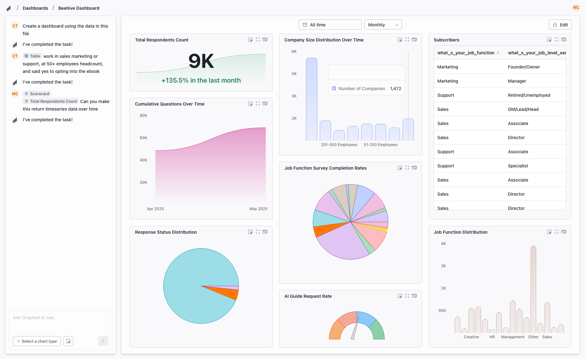
1. Graphed — AI Data Analyst (No Dashboard Building Required)
Graphed is not another BI tool with a drag-and-drop builder. It is an AI data analyst that connects to your live data and builds dashboards, charts, and reports from natural language prompts.
Tell it "show me monthly revenue by acquisition channel with a breakdown by product category" and the AI writes the query, pulls the data from your warehouse, and configures the visualization. No SQL, no DAX, no drag-and-drop canvas.
Data Sources: 350+ pre-built connectors via Fivetran — GA4, Google Ads, Meta Ads, HubSpot, Shopify, Stripe, Salesforce, Klaviyo, and more. Data syncs hourly.
Pricing: $500/month service fee + pass-through data sync costs (~$90–100 per 100K rows). 14-day free trial, 10 seats included, cancel anytime.
Key Strengths:
- Natural language to dashboards — zero learning curve
- Live data connections with hourly sync, not stale exports
- No blending limits, no chart caps
- OAuth setup in 15 minutes, first dashboard in 24 hours
- Works as an embedded data analytics team while the AI continues improving
Best for: Teams without a dedicated data person who are tired of manually building and maintaining dashboards. Companies that want answers from their data, not another tool to learn.
2. Power BI — Advanced Data Modeling on Microsoft's Stack
Microsoft's flagship BI platform. If your organization runs on Azure, SQL Server, and Excel, Power BI integrates seamlessly. DAX (Data Analysis Expressions) gives you a powerful formula language for complex calculations, and Power Query handles data transformation before it reaches your reports.
Pricing: Free desktop app (Windows only); Pro at $10/user/month; Premium at $20/user/month or $4,995/month for capacity-based licensing.
Key Strengths:
- DAX for sophisticated calculations and time intelligence
- Power Query ETL built in
- DirectQuery for real-time warehouse queries
- Row-level security and Azure AD integration
- AppSource marketplace with hundreds of custom visuals
Weaknesses: Windows-only desktop app, steep learning curve, costs scale fast at enterprise level.
Best for: Data analysts and enterprises invested in the Microsoft ecosystem that need advanced modeling and governance.
3. Tableau — Best-in-Class Visualization
Tableau has been the gold standard for data visualization for over a decade. Its strength is exploratory analysis — drag data onto a canvas and Tableau suggests the best chart type. Level of Detail (LOD) expressions enable calculations that other tools struggle with.
Pricing: $75/user/month (Creator); $42/user/month (Explorer); $15/user/month (Viewer).
Key Strengths:
- Deepest visualization library of any BI tool
- Exploratory analysis with drag-and-drop
- Handles large datasets well when connected to warehouses
- Strong community and learning resources
Weaknesses: Expensive, requires separate ETL pipeline, licensing model is complex, Salesforce acquisition has shifted product direction.
Best for: Data teams that need best-in-class visualizations and are comfortable paying premium pricing.
4. Metabase — Free and Open Source
Metabase is an open-source BI tool that you can self-host for free. It offers both a visual query builder for non-technical users and direct SQL access for analysts. If you want full control over your data and do not want vendor lock-in, Metabase is the best free option.
Pricing: Free (self-hosted); Cloud from $85/month for 5 users; Enterprise with SSO and permissions is custom.
Key Strengths:
- Completely free if self-hosted
- SQL and no-code query builder
- Clean, modern interface
- No artificial limits on charts or data sources
- Active open-source community
Weaknesses: Requires engineering to host and maintain, no built-in ETL, limited visualization options compared to Tableau or Power BI.
Best for: Technical teams with SQL skills and engineering resources to self-host.
5. Domo — All-in-One Cloud BI
Domo bundles ETL, data warehouse, and visualization into a single cloud platform. Its Magic ETL tool handles data transformation without code, and it has over 1,000 pre-built connectors. The trade-off is cost — Domo is significantly more expensive than most alternatives.
Pricing: Custom, opaque pricing. Generally considered expensive.
Key Strengths:
- Built-in ETL (no external pipeline needed)
- 1,000+ connectors
- Mobile-first design
- Embedded analytics and alerts
- Pre-built dashboard templates
Weaknesses: Expensive, slow with very large datasets, not marketing-specific, pricing lacks transparency.
Best for: Mid-market companies that want an all-in-one platform and can stomach the price tag.
6. Klipfolio — Lightweight Marketing Dashboards
Klipfolio is a dashboard builder focused on KPI tracking and marketing metrics. It has 300+ integrations, pre-built templates for common marketing use cases, and a drag-and-drop interface that is approachable for non-technical users.
Pricing: Starts at $125/month for 4 dashboards. Per-dashboard pricing model.
Key Strengths:
- Marketing-focused templates and metrics
- Clean, visual interface
- Affordable for small teams
- Good for client reporting
Weaknesses: No data transformation, limited governance, dashboard cap on lower tiers.
Best for: Small marketing teams and agencies that need polished KPI dashboards without complexity.
7. Databox — Simple KPI Tracking
Databox is the simplest tool on this list. It connects to about 130 data sources, offers pre-built templates, and focuses on mobile-friendly KPI dashboards with goal tracking and alerts.
Pricing: Free for 3 sources and 3 dashboards; Starter at $59/month; Professional at $169/month.
Key Strengths:
- Fastest setup of any tool listed
- Excellent mobile experience
- Goal tracking and performance alerts
- Pre-built metric templates
Weaknesses: Free plan is very limited, narrow connector library, no data transformation, not built for complex analysis.
Best for: Founders and small teams who want a simple KPI scorecard on their phone.
8. Zoho Analytics — Budget-Friendly for Small Business
Zoho Analytics is part of the Zoho suite and offers drag-and-drop dashboards, 500+ connectors, basic ETL, and AI-powered insights at a price point that undercuts most competitors.
Pricing: Starts at $24/month (2 users); scales based on data rows and users.
Key Strengths:
- Affordable
- Broad connector library
- AI assistant (Zia) for natural language queries
- Tight integration with Zoho CRM, Desk, and other Zoho products
Weaknesses: Performance issues with large datasets, variable connector reliability, less polished than enterprise tools.
Best for: Small businesses already using Zoho products that need basic analytics on a budget.
9. Qlik Sense — Associative Data Exploration
Qlik Sense takes a fundamentally different approach to BI with its associative engine. Instead of pre-defined queries, you click through data points and the engine dynamically highlights related connections. This makes it powerful for exploratory analysis and discovering patterns you were not looking for.
Pricing: Custom. Generally enterprise-level.
Key Strengths:
- Unique associative data model
- Strong for ad-hoc exploration
- Cloud and on-premise deployment options
- In-memory processing for speed
Weaknesses: Steep learning curve, proprietary scripting language, expensive, not marketing-specific.
Best for: Enterprise data teams that value exploratory analysis and already have complex data infrastructure.
10. Sisense — Embedded Analytics for Product Teams
Sisense is built for embedding analytics into your own product. If you are a SaaS company that wants to offer dashboards to your customers inside your app, Sisense is purpose-built for that. Its ElastiCube engine handles large datasets, and multi-tenancy support keeps customer data isolated.
Pricing: Custom. Enterprise-level.
Key Strengths:
- Best-in-class embedded analytics
- White-label dashboard builder
- Multi-tenant architecture
- Handles large datasets with in-chip processing
Weaknesses: Expensive, complex setup, requires technical resources, overkill for internal reporting.
Best for: SaaS companies building analytics features into their product for customers.
How to Choose the Right Alternative
Here is a decision framework based on your actual situation:
- No budget, Google-heavy stack → Stay on Looker Studio (it is still the best free option for Google ecosystem data)
- No budget, SQL skills available → Metabase (free self-hosted)
- No technical team, want answers fast → Graphed (AI does the analysis)
- Microsoft ecosystem → Power BI
- Best visualizations → Tableau
- All-in-one platform → Domo
- Small business on Zoho → Zoho Analytics
- Simple KPI tracking → Databox or Klipfolio
- Embedded analytics in your product → Sisense
- Exploratory data discovery → Qlik Sense
The Bottom Line
Looker Studio is a great starting point, but it is a starting point. Every tool on this list solves specific problems that Looker Studio cannot — whether that is data modeling (Power BI), visualization depth (Tableau), self-hosting (Metabase), or eliminating dashboard building entirely (Graphed).
The question is not which tool has the most features. It is which tool matches how your team actually works and what you need from your data today.
Related Articles
How to Create a Photo Album in Meta Business Suite
How to create a photo album in Meta Business Suite — step-by-step guide to organizing Facebook and Instagram photos into albums for your business page.
Is Google Analytics and Data Analytics the Same?
Is Google Analytics and data analytics the same? No — Google Analytics is one tool, data analytics is the broader discipline. Here is the difference.
What Database Does Tableau Use?
What database does Tableau use? Tableau connects to 100+ databases — it does not store data itself. Learn how live connections and extracts work.